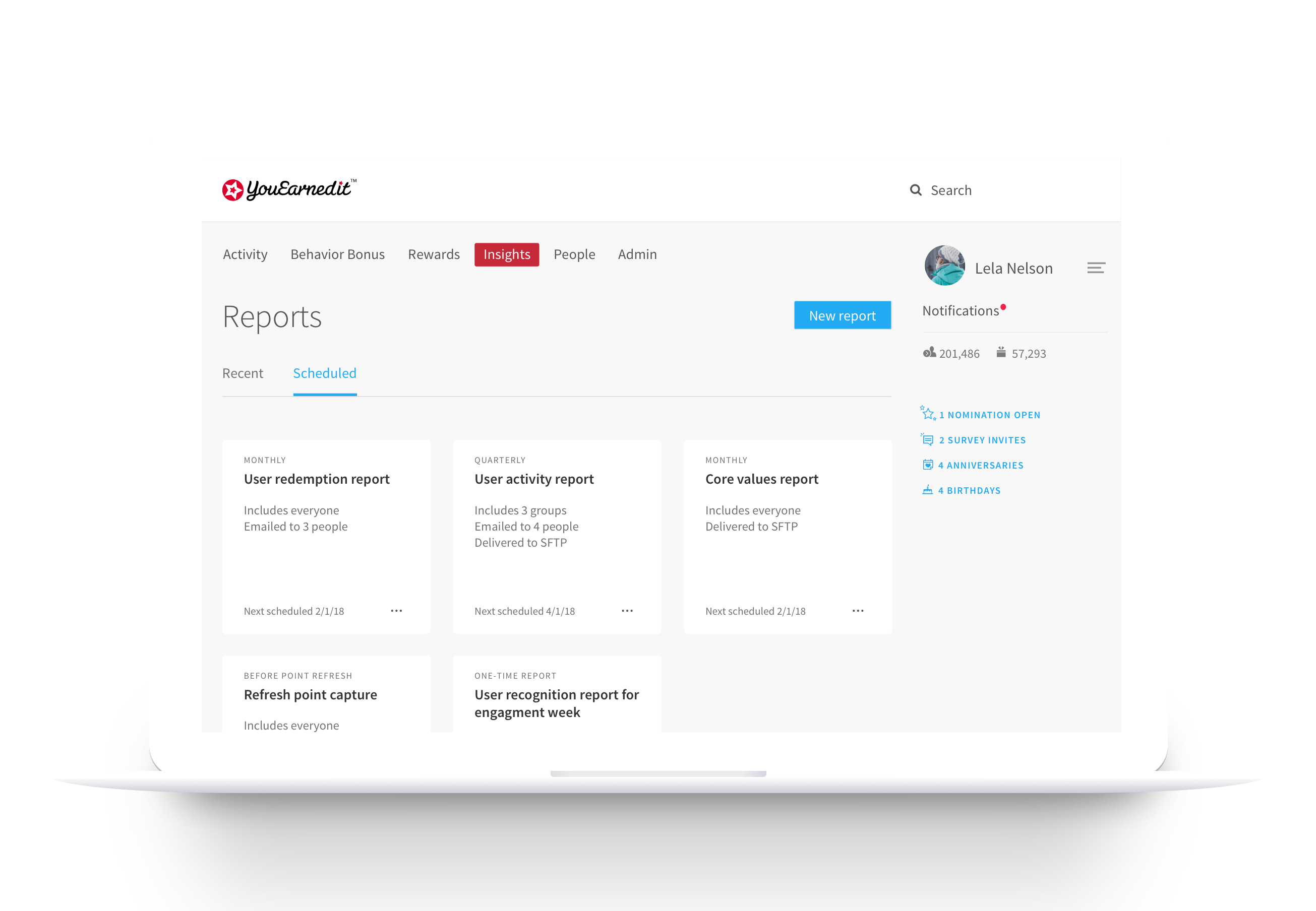

Although admins often downloaded the same reports on a regular cadence, the YouEarnedIt product had no way of automating this process.
This project focused on streamlining the process for downloading reports by allowing admins to set up scheduled, recurring reports and giving them visibility into the status of their requested reports in a download queue.
Company
YouEarnedIt
Role
Research, UX, visual design
Collaborators
A content strategist and a product manager
YouEarnedIt admins were downloading the same reports regularly (e.g., a taxable redemptions report every pay period), but the process for downloading these reports was manual. A number of customers had requested the ability to create scheduled reports.
For platform performance reasons, reports were generated and delivered via email after an unspecified, varying amount of time. There was no way for the user to see if the report was still in progress or if it had failed, and the only way to download a report was from the link in the email.
The goal of our research was to validate the need for report scheduling and understand how admins might use scheduled reports.
We conducted user interviews with 8 report-heavy users from varying company sizes.
To analyze the data, we used an affinity diagram to sort the interview notes into key themes.
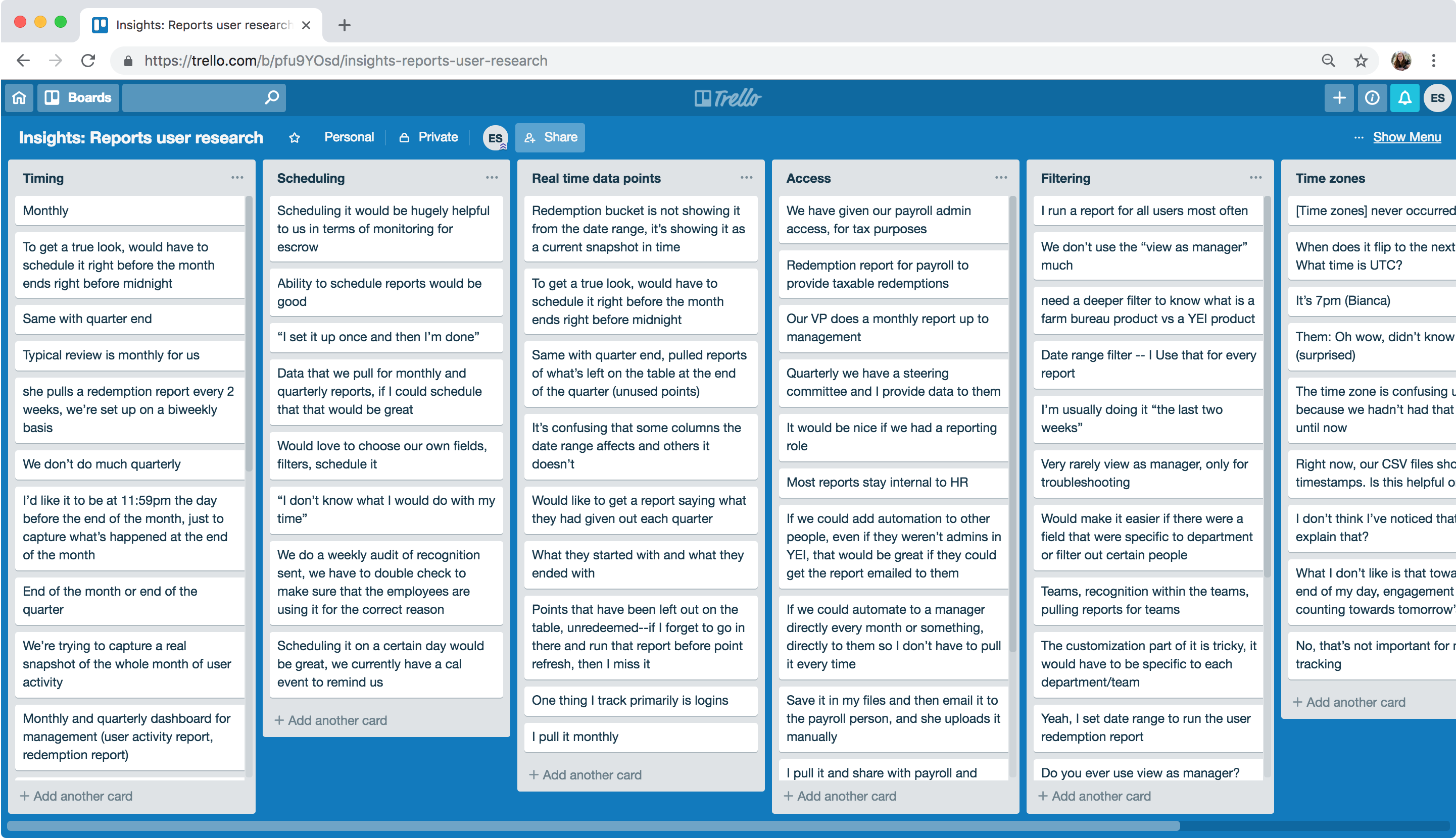
The most common recurrences for reports were weekly, biweekly, semi-monthly, monthly, and quarterly. Admins want to pull reports on point balances right before and right after point refresh.
Users generally don’t filter people before exporting. However, they are manually sorting/filtering the CSV in Excel after downloading it.
Admins are often pulling reports for payroll and then emailing them to the finance team. Some admins are trying to teach managers how to use reports, but others are frequently pulling reports for them.
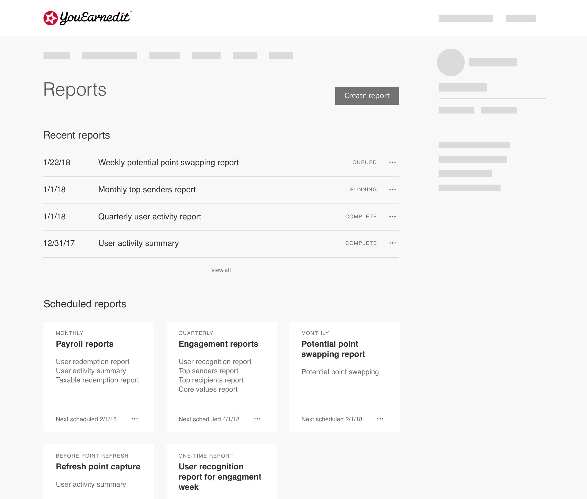
Users visiting the reports page needed to do three things: create reports, see their recurring reports, and check the status of their recently requested reports.
My initial wireframe broke up the information by putting the recent report queue and the scheduled reports into different sections on the page.
However, I realized that the recent and scheduled reports weren’t actually that closely related.

I iterated on that initial wireframe and ended up breaking the information into two tabs.
This lets the user easily see the status of their recent reports. Scheduled reports are managed in their own tab, since that's more of a "set it and forget it" option.
I explored a couple different options for report creation.
Pros: Breaking each step out will help users understand the report options and will drive usage of filtering reports
Cons: Four steps to download a simple report makes the process feel arduous
Pros: Report creation process feels quicker, and heavy users who download reports often can do it more easily
Cons: Users may miss options (like filters) or be overwhelmed by all the possible options
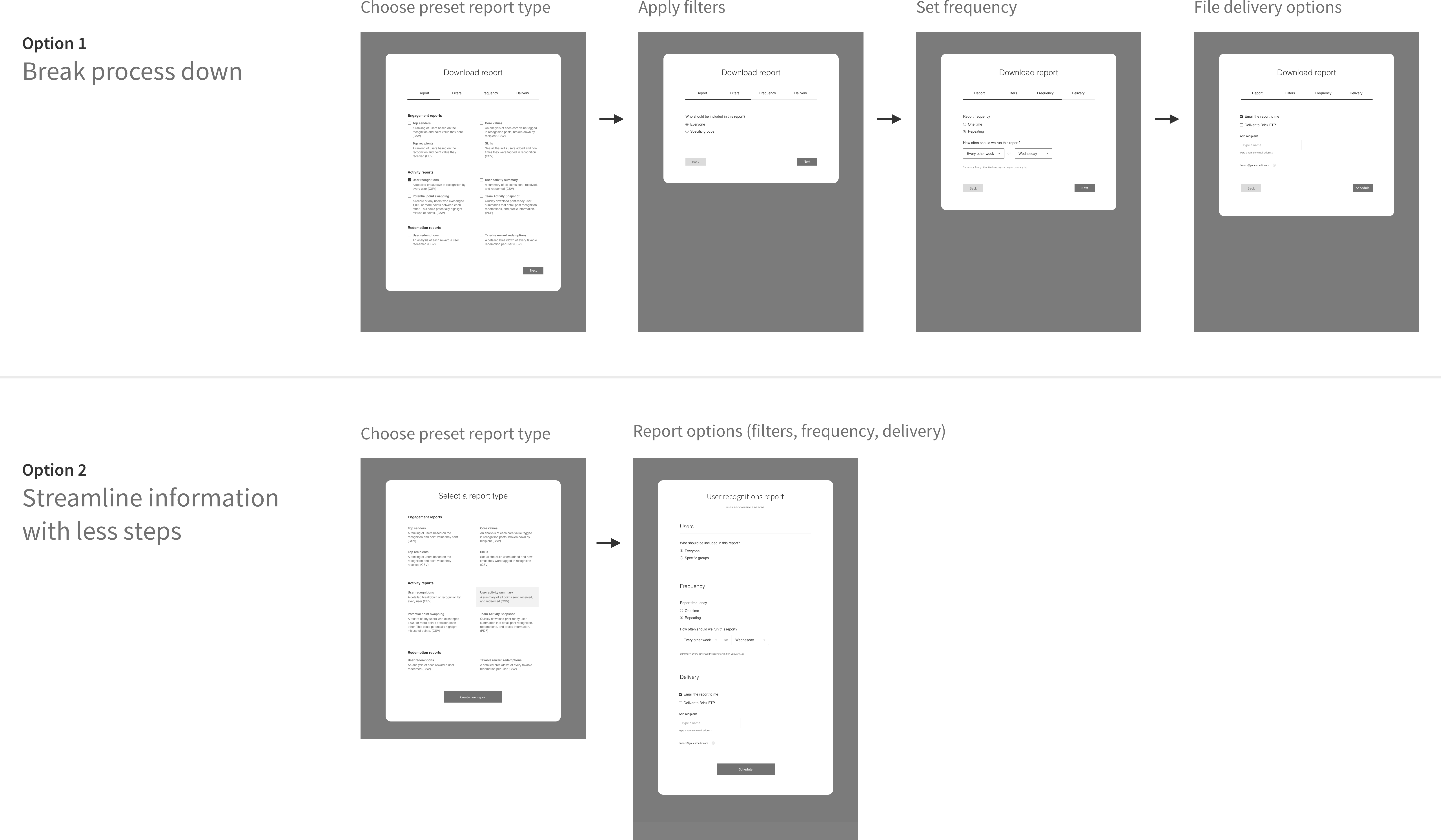
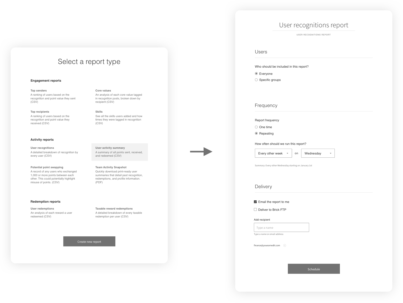
I sought feedback from the design team and the customer success team (who work closely with admins). Based on the feedback, I went with the second option.
Ultimately, the admins that download reports do so frequently. I wanted to streamline the process as much as possible for them. And there really aren’t that many options that they need to be broken up.
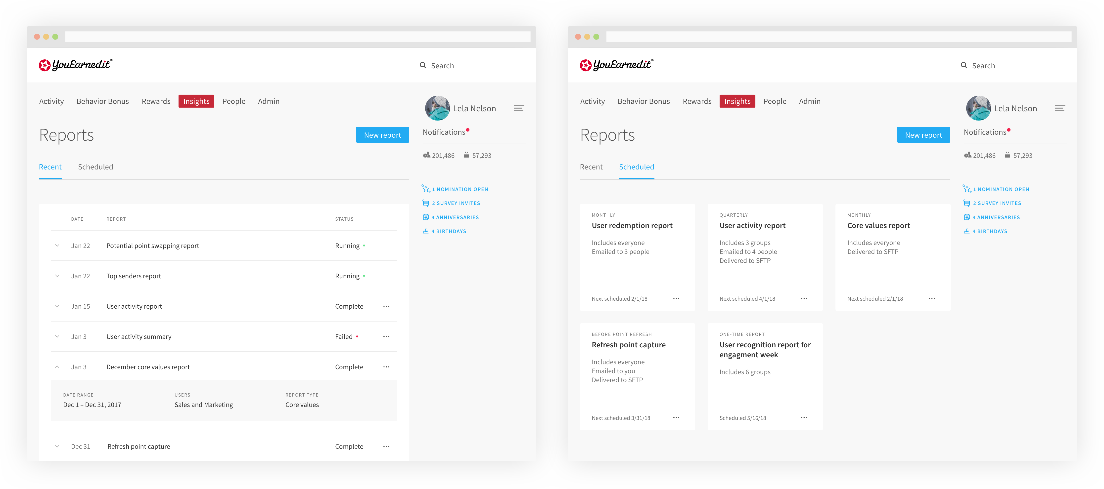
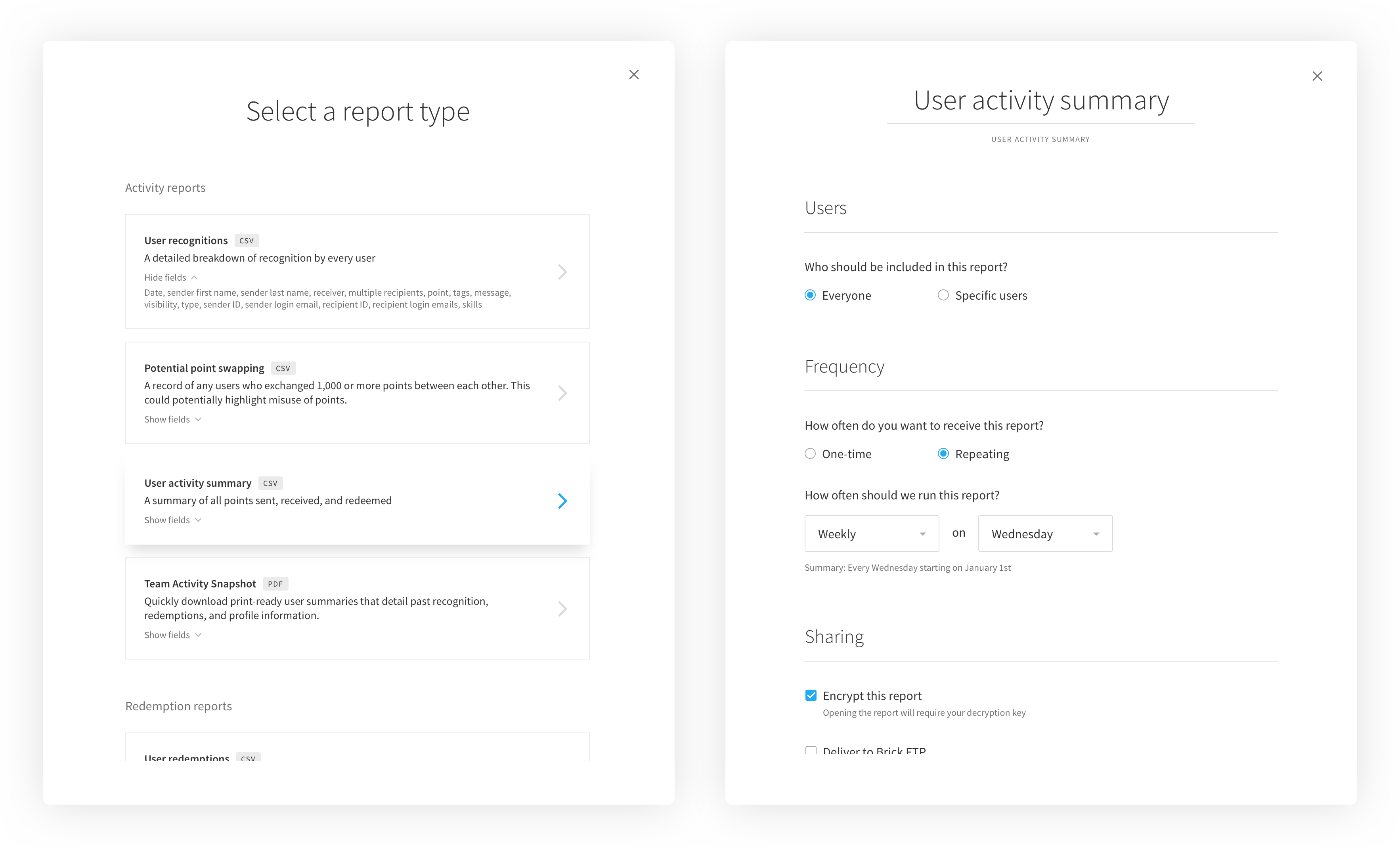
Unfortunately, toward the end of the design process, this project was deprioritized on the roadmap in favor of back end performance improvements. Implementation timeline is still to be determined.