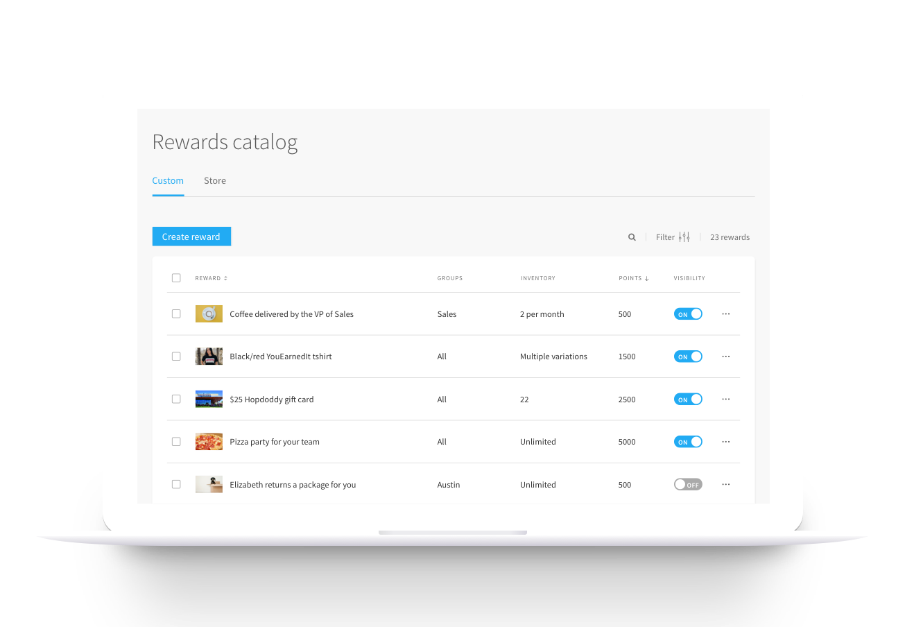

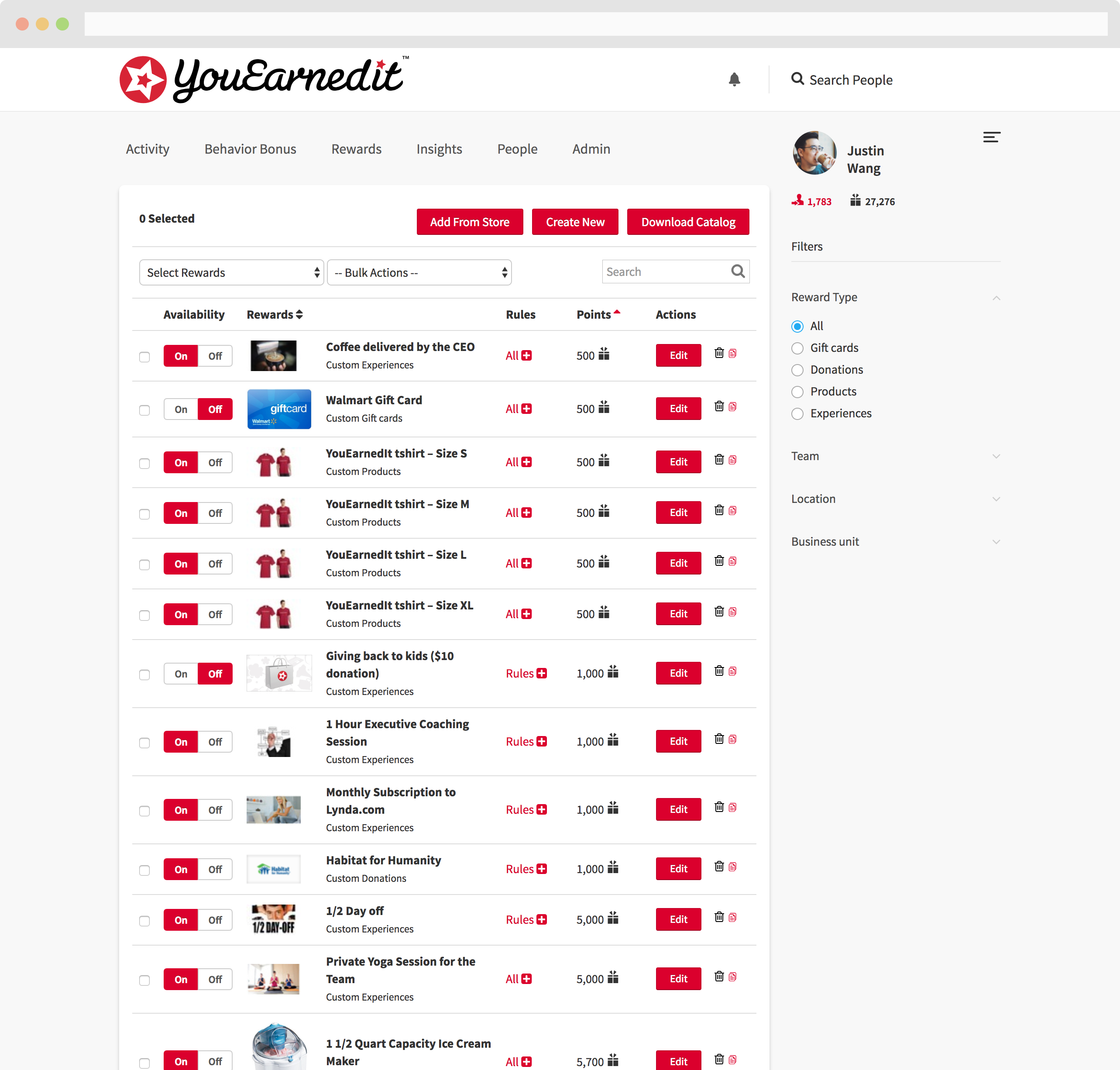
Despite the reward catalog being core to the YouEarnedIt admin experience, these pages hadn't been touched in years, and we’d gotten repeated feedback that they were difficult to use.
The redesign focused on simplifying these information-dense pages and surfacing the most relevant information.
Company
YouEarnedIt
Role
Research, strategy, UX, visual design
Collaborators
Two product managers, a content designer, several developers
Since the reward catalog admin has existed in the product for several years, we were able to clearly define the failings of the current design from a combination of past user interviews and common support requests.
Custom rewards and YouEarnedIt-fulfilled rewards were treated the same, even though custom rewards have different attributes and require more management from admins.
If a reward has special configurations like a taxable status or approval process, there’s no way to see that in the table.
When companies assign certain rewards to specific groups (e.g., a reward just for the sales team), the data table doesn't show which groups.
Country-specific rewards were not automatically shown to the appropriate international users.
For items with multiple variations (like a t-shirt with several sizes), each variation had to be its own individual reward listing.
Additionally, inventory input only went up to 25 items, and it wasn't easy to see how much inventory remained.
I asked a developer to pull usage data on all 399 active companies with reward catalogs. From that data, I was able to create a more accurate picture of the average company’s reward catalog.
Most company's catalogs have between 100-300 active rewards. 81% of all companies have less than 200 rewards.
While YouEarnedIt-fulfilled rewards make up 85% of the catalog, it’s the 15% of custom rewards that represent the majority of admin time.
When it comes to assigning a reward to specific groups, companies are either limiting almost all of their rewards or almost none of them. 75% of customers fall into one of those two buckets.
“I try to make rewards that are useful and curated. I don’t want to make it so you’re searching through a huge giant pond.”
YouEarnedIt admin
The old design had two core problems: There was too much information in too little space, and the wrong information was being surfaced.
With the redesign, I focused on giving the pages some breathing room and showing the user the right information at the right time.
Separating custom rewards and store rewards into different tabs allowed me to surface the most relevant columns for the different reward types.
For example, admins can track inventory with custom rewards but not store rewards (YouEarnedIt manages inventory for those). Therefore, I only surfaced the "Inventory" column for custom rewards; store rewards have the "Availability" column.
Despite store rewards making up a larger percentage of a company's catalog, custom rewards represent the bulk of management time, so I chose to put that tab first.
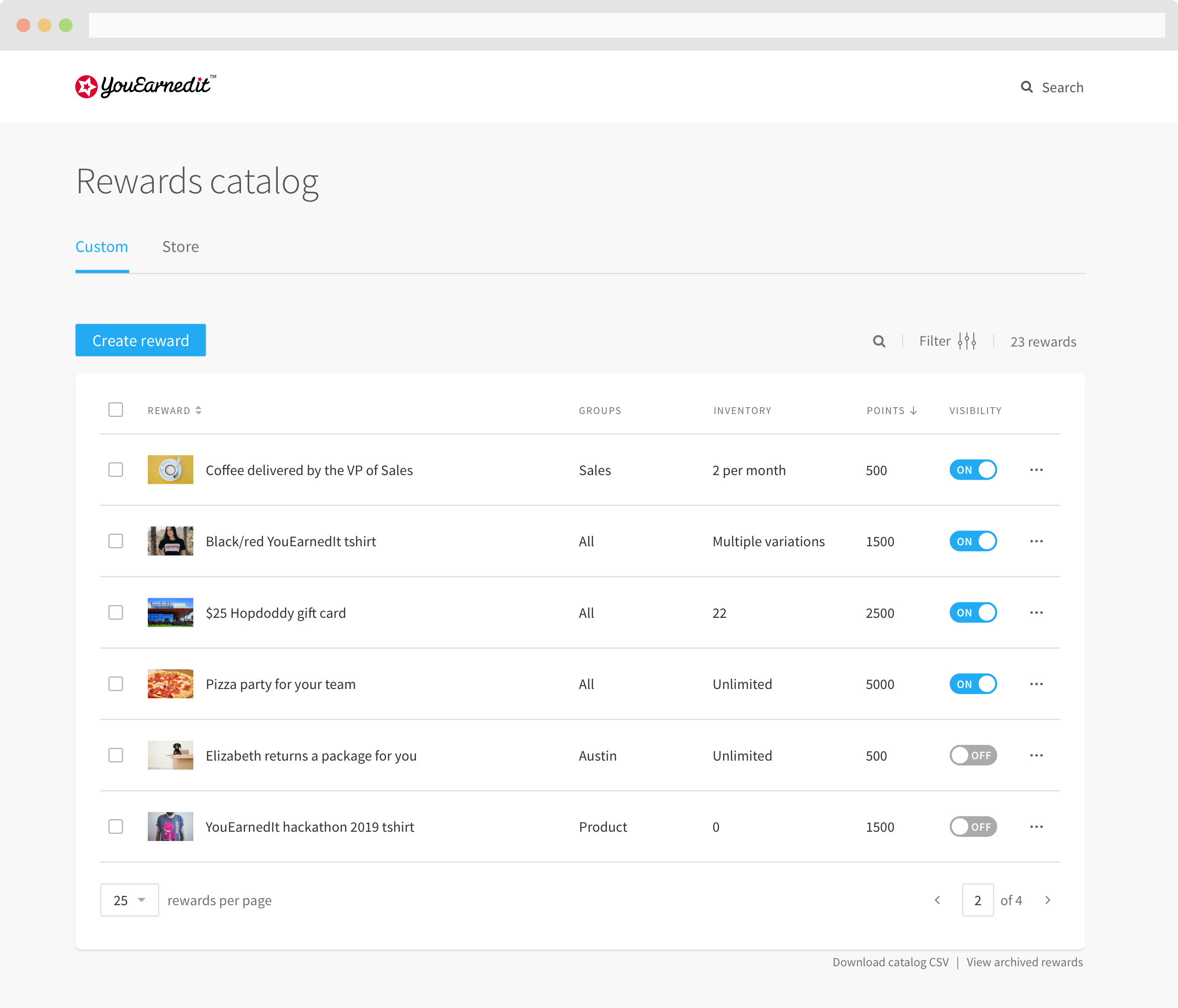

Expandable rows make secondary information easily accessible without having to open a modal.
The information displayed in the expanded row is contextual to the reward (e.g., if the reward doesn't have a fulfiller, there won't be a data point for that).
Admins using the old reward catalog found it difficult to understand which employee populations could see a reward.
The new design makes it clear during reward creation whether you're creating a reward for everyone or just certain users.
To make reward management easier, groups are listed in the data table. For one or two groups, you’ll see the names in their entirety. For 3+ groups, the full group list is available in the expanded view.
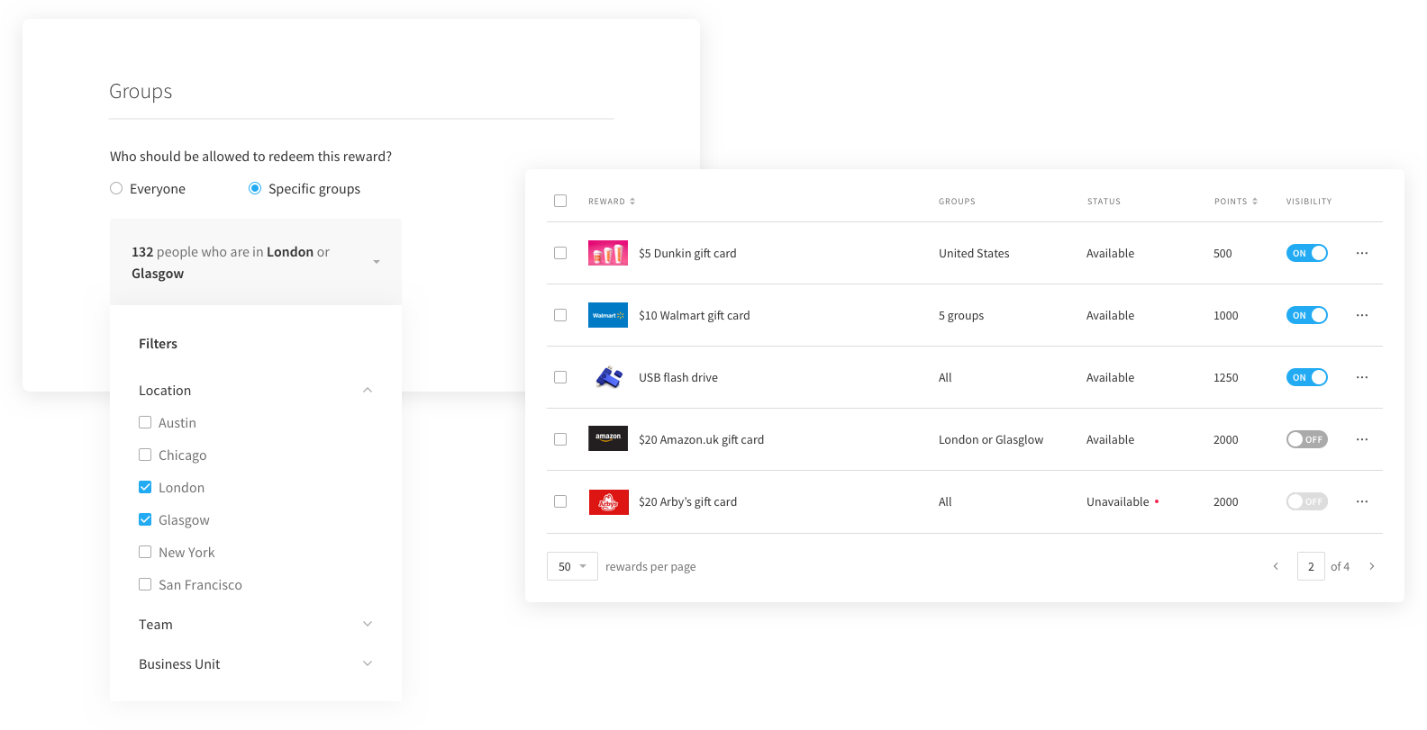

One huge pain point for admins was having to manually assign international rewards to the appropriate group.
I wanted to automatically show the right rewards to the right international populations, but that’s currently impossible due to the freeform structure of groups in YouEarnedIt—the product has no concept of which groups are “Country” or “Location.”
My solution was to surface the reward country in the row’s expanded view, so that admins can make sure they have rewards assigned to the right international groups. In the future, we hope to reinvision the way the product structures groups.
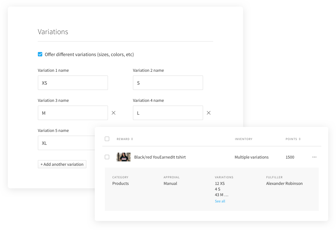
An important feature in the new design was the concept of variations (sizes, colors, etc). Previously, admins would have to make individual reward listings for each size or color.
I also updated inventory so an admin can easily track their inventory per variation. Inventory is displayed in the reward catalog table for each item so an admin can keep tabs on how much is remaining.
Throughout the design process, I met frequently with stakeholders and members of our customer success team (who work most closely with admins) to incorporate their comments and suggestions.
While I haven’t had the opportunity to get feedback from many admins, the few who have seen it have all said the same thing: “When can we have this?!”
This project is expected to enter the build phase in early 2019.