The primary goal in developing a design system for the YouEarnedIt product was to unite everyone who works on the product under a single, shared design language.
For the past year and a half, I’ve lead the ongoing initiative to implement and roll out the YouEarnedIt design system, which we recently dubbed Confetti.
Company
YouEarnedIt
Role
Research, strategy, UX, visual design, design ops, project management
Collaborators
Entire design team, a content strategist, two product managers, a team of developers
Disparate UI elements and design patterns are confusing for users. And it’s frustrating for developers when they have to build yet another similar component.
Having to reinvent the wheel (aka, figure out what a button looks like) every time a new feature is requested isn’t scalable, and it isn’t fun either.
A set of reusable components and clearly defined design patterns allow both designers and devs to build better experiences faster.
Even though the design system would be an internal product, I thought that user interviews were a good place to start. Our entire small design team would be involved in creating the design system, so I decided to focus primarily on developers.
I interviewed 7 developers with skillsets from backend to frontend and company tenures ranging from a few months to a few years.
There was no central location or knowledge base for components. Sometimes this meant that a developer would build a component but find out later that they didn’t need to.
“[Knowing if a component exists is] a combination of experience and asking the dev team if you’re not sure.”
Developers were spending anywhere from 10-40% of their time (depending on the project) creating new components.
“We don’t have the mindset of things being used everywhere. Occasionally, I’ll find that a component might work but isn’t as global as it should be.”
Both for the sake of consistency and making the development process smoother and easier, devs were excited about reusable components.
“If I look at a new design and see a bunch of things that are already built, that’s exciting. It’s like legos, you’re just plugging that in.”
I went through the entire product documenting all the different instances of components and design patterns. The goal of the audit was to understand our starting point for the design system. For some components, there was wild inconsistency. For others, there were relatively well-established patterns with only a few outliers.
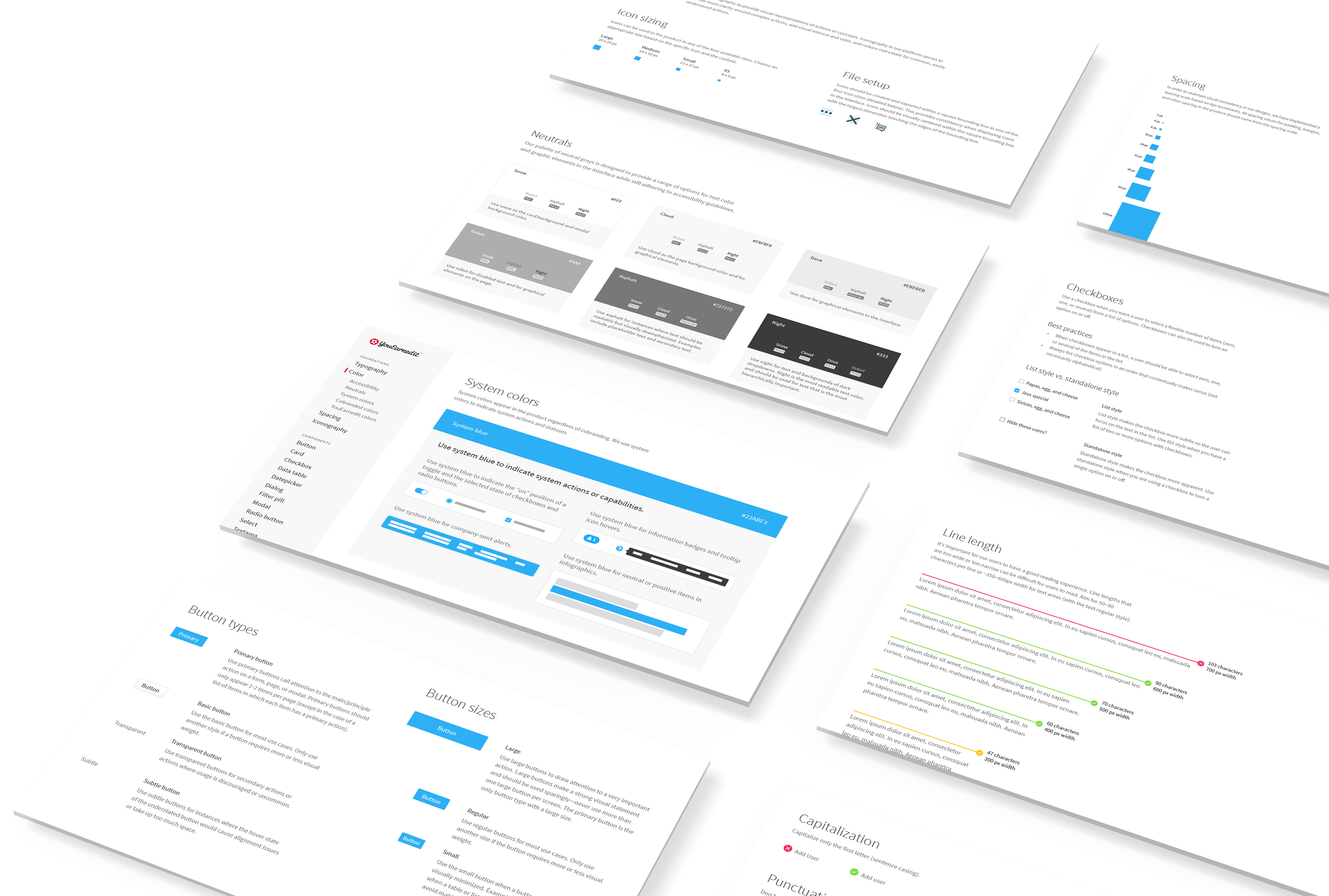
I compiled the results of the audit along with industry best practices for each component or design pattern into a series of presentations to the design team.
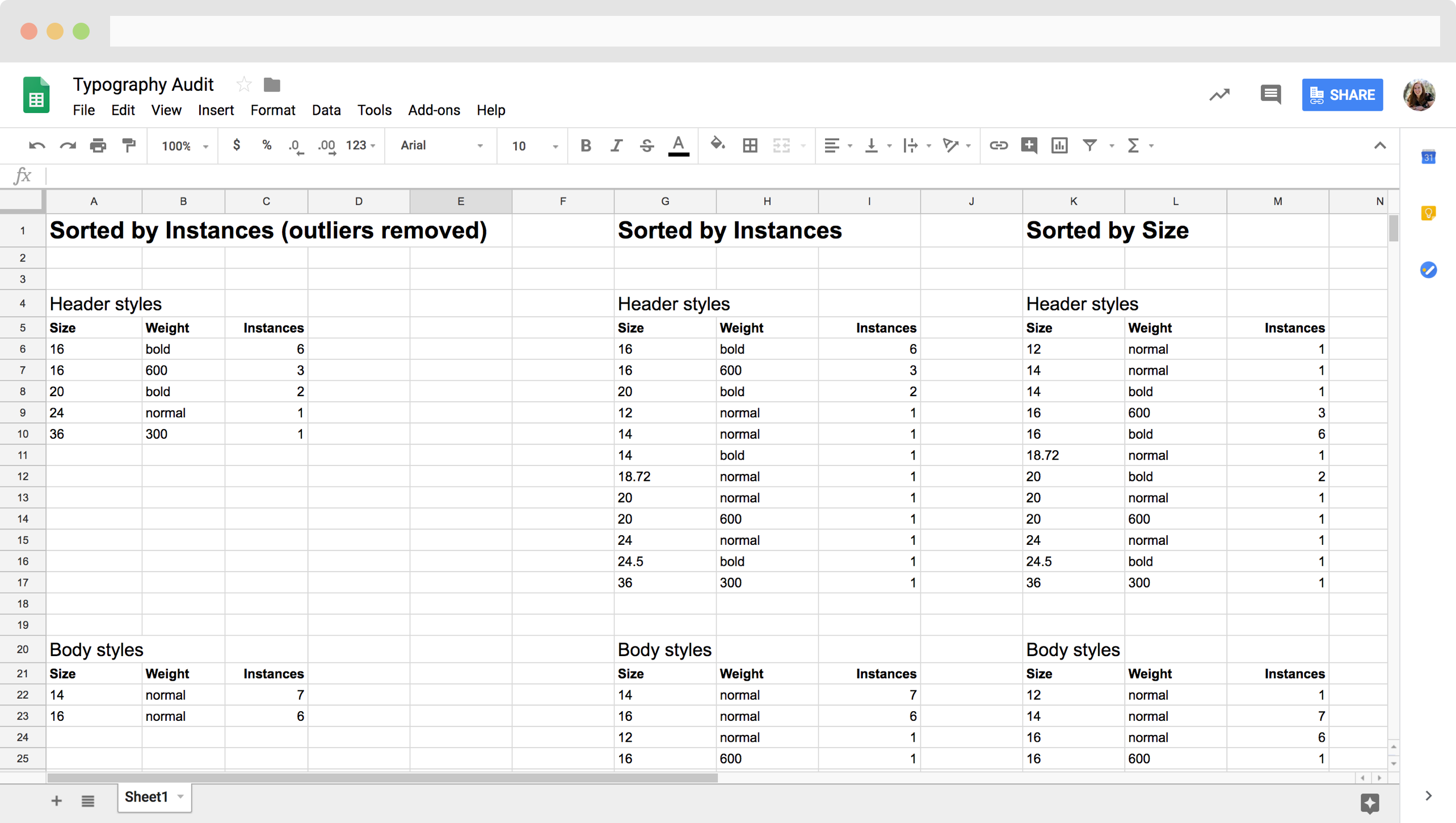
I audited 19 key components/screens. I detailed all of the typographic styles I found, broken down by purpose (like “body” or “utility”).
Once I eliminated the outliers, I was left with a pretty clear picture of the different sizes and weights used for each typographic style.
Once an audit was complete, I'd create an initial proposal for the design system version of the component and present to the design team. After several rounds of iteration and revision, we’d reach the final version of the component.
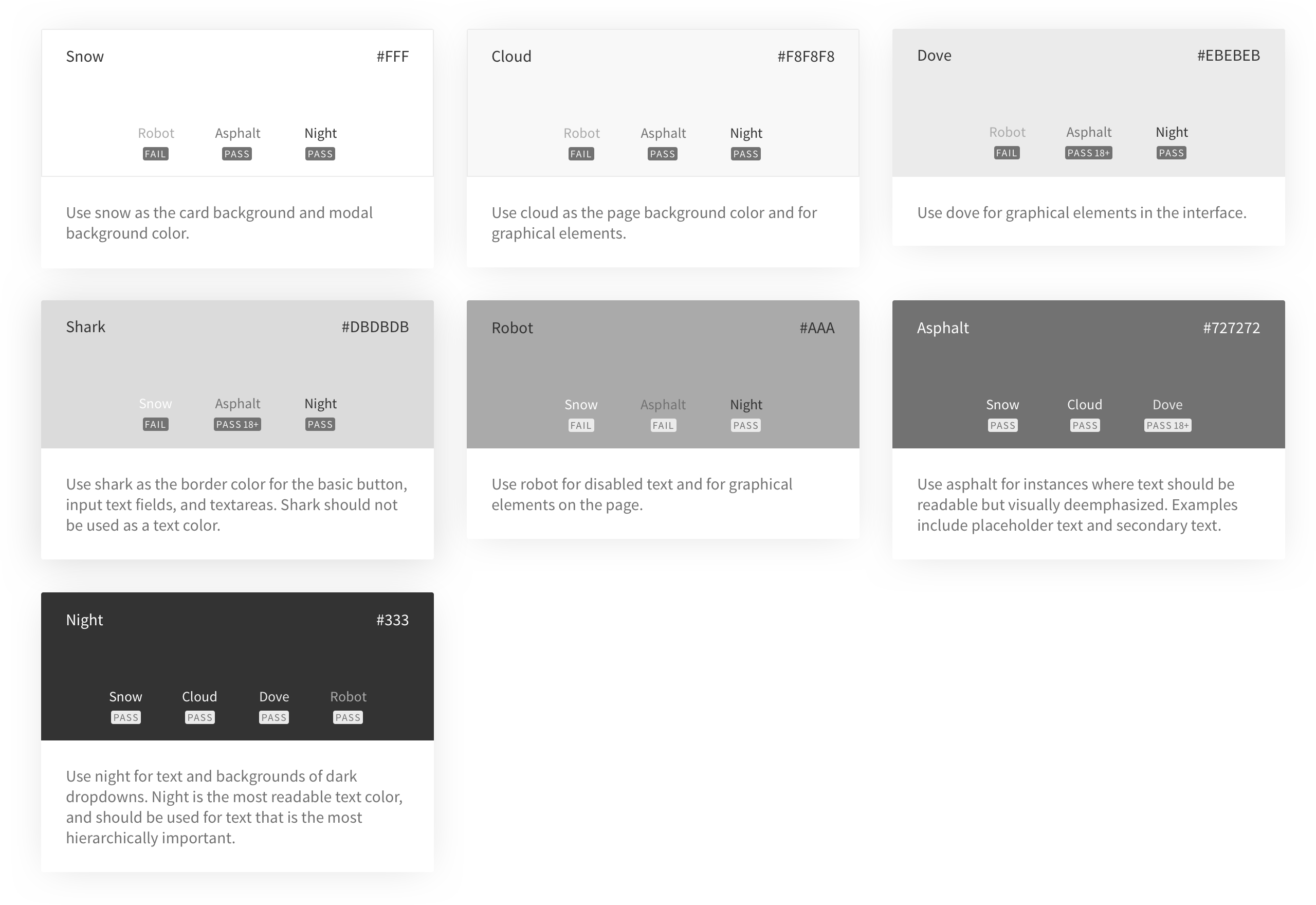
Based on the results of the neutral palette audit, I distilled the 32 different shades of gray I found into 7 by looking at the most-used colors and removing outliers.
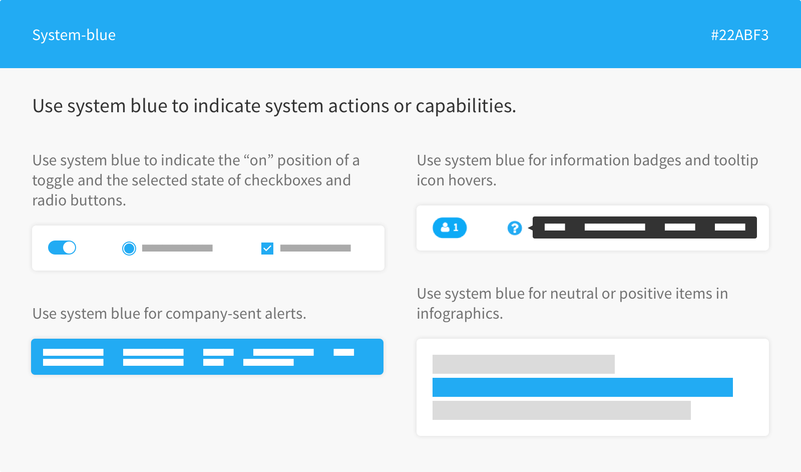
With every design system component I worked on, I wanted to consider accessibility. With colors, for example, I ensured that the two body text colors (asphalt and night) had an appropriate contrast ratio with snow and cloud-colored backgrounds.
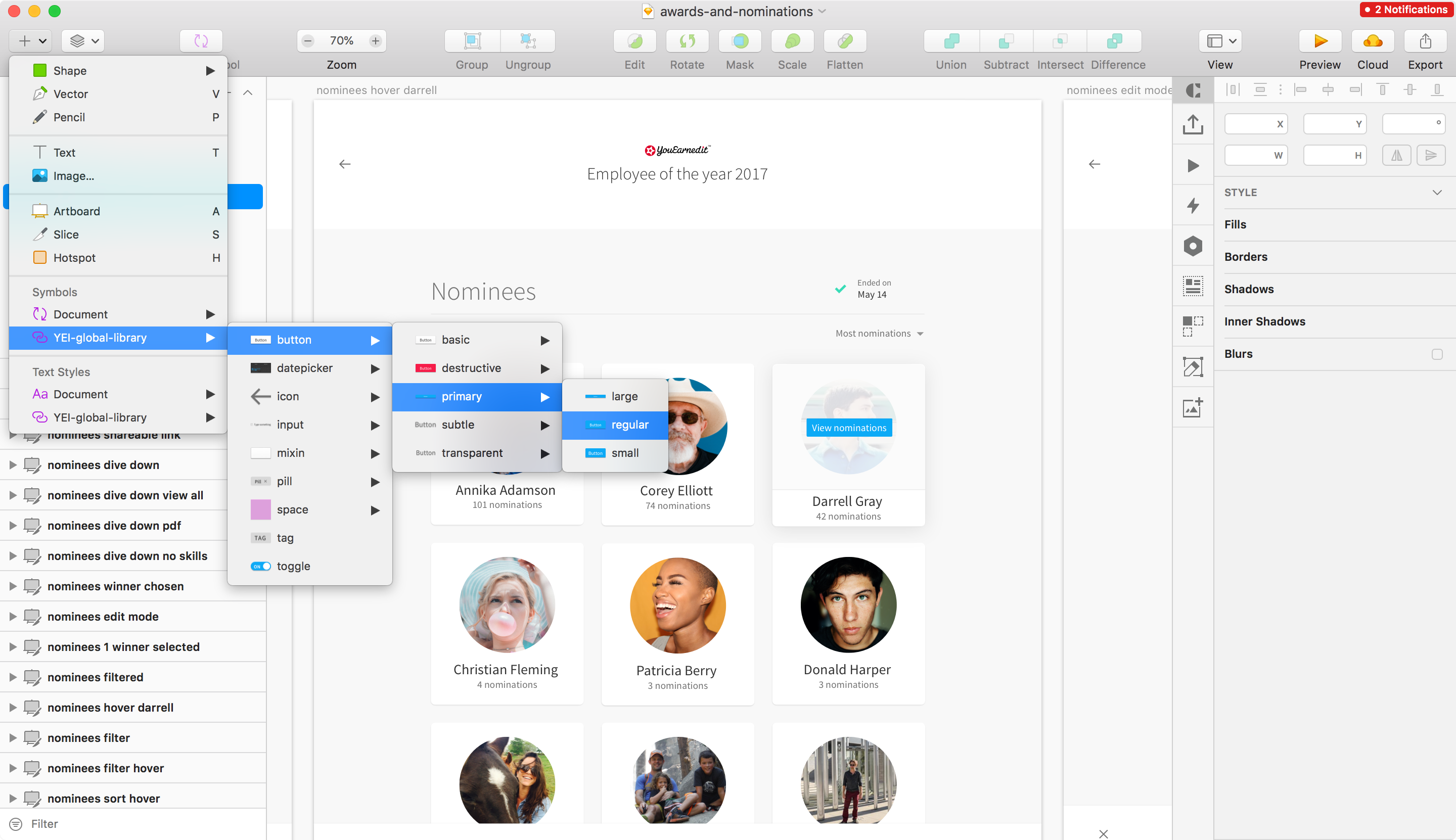
For each finalized design system component, I created a Sketch symbol that includes all the different sizes/states/options.
Each symbol lives in the YouEarnedIt Sketch library, which serves as the single source of truth for component design.
While the Sketch library may be the design source of truth, the React component is the true source of truth.
A group of front-end developers and I meet regularly for design system grooming to discuss the components and how we’ll approach building them.
I currently maintain a backlog of Jira tickets for the design system. When a developer picks up a ticket, we work closely to make sure both the visual design and interaction design translate to the finished component.
For each component, I wrote documentation around the usage, examples, best practices, and content guidelines for our Confetti guide in Confluence.
We recently moved our React components into Storybook, and I’m working to move documentation there too so the components can live side-by-side with the documentation.
YouEarnedIt recently merged with HighGround, and an effort is currently ongoing to integrate the two products. The Confetti design system will play a critical role in bringing the two products together into one platform.
We’ll be rolling out our new combined company brand soon and iterating on the visual design of the Confetti components to match the new brand.